A Detailed Guide On Webflow Responsive Design & 11 Best Practices To Follow
Mobile-friendly Webflow sites boost sales and SEO. Learn how to create a Webflow responsive design with a help from NUMI.

You build a beautiful website in Webflow, and then the unthinkable happens. You tested it on mobile, and it looks awful. Instead of being a sleek, polished version of your desktop site, the mobile version is a jumbled mess. The images are too big, the text is too small, and the layout is all out of whack. When this happens, it’s not only frustrating, but it's also bad for business. Research shows that over half of all website visitors now use mobile devices. If your site doesn’t look good on mobile, you risk losing more than half of your potential customers. If that weren’t enough, Google also prioritizes mobile-friendly sites in its search results, meaning a poor mobile design can hurt your Webflow SEO ranking, too. This article will teach you how to create a responsive web design in Webflow so that you never have to worry about what the mobile version of your site looks like again.
Webflow developers like NUMI can help you achieve your goals even faster. Our team can build you a responsive site that looks great on every device so that you can focus on more important business matters.
What Is Responsive Web Design?
Responsive web design is a modern approach to web development that ensures your website looks and functions well across various devices, from desktops and laptops to:
- Tablets
- Smartphones
Responsive Design Basics
The core idea behind responsive design is to create websites that automatically adjust their layout, images, and content to fit the screen size and orientation of the device being used. This flexibility ensures that your site is always aesthetically pleasing and easy to navigate, whether viewed on a large desktop monitor or a small mobile screen.
The concept of responsive web design was first introduced in 2010 by Ethan Marcotte. He was inspired by the idea of architecture that adapts to the presence of people, and he applied this principle to web design. According to Marcotte, responsive design relies on 3 key elements:
1. Fluid Grids
These are flexible grids that scale proportionally based on the screen size. Instead of using fixed pixel measurements, fluid grids use relative units like percentages, allowing the layout to adapt smoothly as the screen size changes.
2. Flexible Images
Images in responsive design are also designed to be fluid, meaning they scale up or down depending on the screen size. This prevents images from overflowing or becoming too small to see, maintaining a balanced look across devices.
3. Media Queries
These CSS techniques apply different styles based on the characteristics of the user's device, such as:
- Screen width
- Resolution
- Orientation
Media queries help define breakpoints where the layout shifts, ensuring content is displayed optimally for each device.
Mobile-First Approach
Responsive web design goes beyond just creating a simplified version of your site for mobile users. With the rise of smartphones, mobile internet usage has exploded, from generating only 2.94% of web traffic in 2010 to over 54% by 2021.
Today, many users rely on mobile devices as their primary means of accessing the web, and they expect a fully functional, seamless experience. Whether reading articles, shopping online, or interacting with content, users want to do it on mobile without compromising.
No-Code Solutions
The rise of no-code design tools has simplified the creation process of responsive websites. These tools allow designers to build websites that automatically adjust to different screen sizes without manually coding each adjustment.
This makes responsive design more accessible and easier to implement, even for those without extensive coding knowledge.
Responsive vs. Adaptive Design
While responsive design is currently the industry standard, it’s worth mentioning adaptive design as a contrasting approach. Adaptive design involves creating separate, streamlined website versions for different devices.
You might recognize this when you’re redirected to a mobile-specific subdomain like m.website.com or mobile.website.com. The 2011 book Adaptive Web Design: Crafting Rich Experiences with Progressive Enhancement popularized this approach.
Choosing the Right Approach
Adaptive design offers some advantages, such as the ability to tailor the mobile experience very precisely. This can be useful for complex sites requiring a high control level. The downside is that it requires developing and maintaining multiple site versions, which can be time-consuming and costly.
Responsive design is the better choice for most:
- Small-to-medium-sized businesses
- Individuals
Consistent Experience
It provides a unified, consistent experience across all devices, crucial for maintaining brand integrity and ensuring user satisfaction.
Related Reading
- Webflow Integrations
- Webflow Websites
- Webflow Cost
- Webflow Logic
- Wordpress To Webflow Migration
- Webflow Maintenance
- Webflow Security
- Webflow Interactions
- Webflow Performance
Why It's Crucial To Have A Responsive Web Design
A responsive web design ensures a seamless and user-friendly experience across all devices. Whether someone is browsing on a desktop, tablet, or mobile phone, they’ll have access to the same content and functionality without the frustration of zooming in and out or dealing with a clunky interface.
This consistency is key to keeping users engaged and satisfied, ultimately encouraging them to stay longer on your site and return in the future.
Responsive Design Is More Cost-Effective
From a business perspective, a responsive design is far more cost-effective than creating separate website versions for different devices. Instead of developing and maintaining multiple sites, you can focus on one site that adapts to any screen size.
This saves time and money and simplifies the development process, making it easier to implement:
- Updates
- New features
Responsive Design Improves Visibility
In terms of visibility, responsive websites have a significant edge. Search engines like Google favor sites that are optimized for mobile, which means a responsive design can help your site rank higher in search results.
This increased visibility makes it easier for potential visitors to find you, leading to more traffic and greater opportunities for engagement.
Ease of Management
Managing a responsive website is also much simpler than juggling multiple versions. With a single site, you ensure your content remains consistent and up-to-date across all devices.
This ease of management reduces the risk of errors and discrepancies, providing a smoother experience for you and your users.
Higher Conversion Rates
One of the most compelling reasons for a responsive design is its impact on conversion rates. When users can easily access your content, no matter what device they’re using, they’re more likely to take the desired action:
- Making a purchase
- Signing up for a newsletter
- Contacting you for more information
Of course, this also depends on having high-quality content that’s optimized for driving conversions, but responsive design is the foundation that makes it all possible.
Responsive Design Generates More Traffic
Responsive design can also help you attract a broader audience, increasing your site traffic. As more people access the internet through mobile devices, having a site that works well on those devices is crucial for reaching and engaging with your target audience. The more accessible your site is, the more likely people are to visit, share, and return to it.
Responsive Design Future-Proofs Your Site
Another important aspect of responsive web design is future-proofing. As new devices and technologies emerge, your responsive site will be better equipped to handle them without needing a complete overhaul.
This adaptability ensures that your website remains relevant and functional, no matter how the digital ecosystem evolves.
Responsive Design Improves SEO Performance
Responsive web design also significantly improves your site’s SEO performance. Search engines favor sites that offer a consistent and optimized experience across all devices, which can lead to:
- Higher rankings
- Better visibility
A responsive design eliminates the need for duplicate content (which can occur with separate mobile sites), further boosting your SEO efforts.
A Responsive Website Leaves Positive Brand Impressions
A responsive, well-designed website leaves a positive impression on your visitors. It shows you care about their experience and are committed to providing a professional, user-centric interface. This builds trust and credibility, making users more likely to engage with your brand and recommend it to others.
Numi For Startup Design Solutions
NUMI is a webflow development agency that world-class webflow developers and product designers power. Backed by Y Combinator, NUMI handles all of your startup's sourcing/vetting/hiring needs for design. Our fabuolous design team ensures all your design work is done well.
NUMI helps with:
- Product design
- Web design
- Framer development
- Webflow development
- Mobile design
- Prototyping
- UX design
- All of your startup's design needs
Expert Design Team
Subscribe to a guild of world-class designers ready to embed on your team today. Schedule a call with us today to learn more!
Does Webflow Have Responsive Design Out Of the Box?
Webflow has a unique approach to responsive design that begins with the desktop breakpoint. When you create a responsive site in Webflow, you start by designing the layout for larger screens, establishing a solid foundation for the following:
- Visual hierarchy
- Content placement
- Overall aesthetics of the site
Understanding Webflow Breakpoints
Breakpoints are the foundation for crafting responsive websites within the Webflow platform. They act as invisible lines across the screen width, dictating how your website's layout and design adapt to different device sizes.
Imagine them as checkpoints where your website transforms to fit the specific screen dimensions of a:
- Desktop
- Tablet
- Mobile landscape
- Mobile portrait view
Webflow Breakpoints
Here's how Webflow breakpoints empower you to achieve responsive design:
- Visualizing screen size changes: Webflow Designer displays your website alongside a set of breakpoint icons representing various devices. Clicking and dragging these icons lets you see how your design adjusts across different screen widths in real time. This provides a clear visual understanding of how elements behave on different devices.
- Setting breakpoint-specific styles: Webflow allows you to define unique styles for each breakpoint. For instance, you may change the layout from a three-column grid on a desktop to a single column on a mobile portrait. You can adjust font sizes, margins, and element visibility to ensure an optimal user experience across all screen sizes.
- Optimizing content flow: Breakpoints help you manage how content reflows on your website. By strategically defining breakpoints, you can prevent essential information from getting cut off or appearing cluttered on smaller screens. You can hide specific elements on certain breakpoints or rearrange them for better readability.
Tips for Using Breakpoints Effectively
- Start with a mobile-first approach: With the rise of mobile browsing, it's wise to design for smaller screens first. This ensures a solid foundation that adapts to larger devices.
- Utilize the default breakpoints: Webflow provides a good starting point with pre-defined breakpoints for desktop, tablet, mobile landscape, and mobile portrait. You can customize these or add new breakpoints for more granular control.
- Test, test, test: Responsive design is an iterative process. Use Webflow's preview mode and browser developer tools to test your website across various devices and screen sizes thoroughly. Based on your testing, refine your breakpoints and styles to achieve optimal responsiveness.
Why Your Webflow Website Is Not Responsive
Fixed Widths and Heights
If you’ve set your elements to specific pixel dimensions, they won’t adjust when the screen size changes. This can cause parts of your content to be cut off, overflow, or display incorrectly on smaller devices.
To fix this, use relative units like percentages or viewport widths (vw) and heights (vh), which scale more naturally across different devices.
Lack of Proper Breakpoints
Webflow allows you to set breakpoints for different screen sizes, like:
- Desktop
- Tablet
- Mobile
If you haven’t adjusted your design for these breakpoints, your site might look great on a desktop but fall apart on smaller screens. Previewing your site at each breakpoint and tweaking your design to ensure everything reflows correctly is essential. This might mean:
- Changing font sizes
- Adjusting margins
- Reordering elements to suit smaller screens
Unoptimized Images and Media
Large images and media files can also affect your site’s responsiveness. If an image is too big and not set to scale properly, it might push your content out of view or slow down the loading time, which can be particularly problematic on mobile devices.
Ensure your images are optimized for the web and set to scale responsively so they look good and load quickly across all devices.
Overcomplicated Layouts
Sometimes, the design itself can be an issue. If your layout is too complex, with many:
- Overlapping elements
- Intricate grids
- Custom code might not translate well to smaller screens
Simplifying your design and sticking to clean, flexible layouts can make a big difference in how your site behaves responsively. What looks stunning on a wide desktop screen might need to be rethought for a narrow mobile display.
Neglecting Mobile Navigation
Navigation is another area where responsiveness can falter. If your site’s navigation menu doesn’t adapt to mobile devices—whether it’s too small to tap, not visible, or awkward to use—it can frustrate your visitors. Consider using a hamburger menu or a different style of navigation that’s more suited to touchscreens.
Also, ensure your buttons and links are large enough to be easily tapped without accidentally hitting the wrong link.
Custom Code Conflicts
If you’ve added custom code to your Webflow project, it could conflict with Webflow’s built-in responsiveness. Custom CSS or JavaScript might work fine on desktops but cause issues on mobiles if not written with responsiveness in mind.
If you suspect this is the case, review your code to ensure it’s compatible with responsive design principles, or consider removing it temporarily to see if the problem resolves.
The Essential Elements Of Responsive Web Design
Design for Diverse Devices: The First Step in Responsive Web Design
Responsive web design accommodates the countless devices people use to access your website. These devices vary widely in:
- Size
- Operating systems
- Screen resolution
- Functionality
When developing a responsive design, thinking beyond desktop and mobile is crucial. Your site should also function smoothly on:
- Tablets
- Smartwatches
- Other Internet-enabled devices
Orientation Flexibility
It’s not just about size. Users also switch between portrait and landscape modes, especially on mobile devices. To handle this diversity, consider your site fluid rather than fixed. It should be able to adapt to any screen size, whether large or small or even for devices that don’t yet exist.
Your site should handle gestures like swiping and pinching on mobile, while on desktops, it should look good regardless of whether a user has maximized their browser window.
Relative Length Units: The Key to Flexibility in Responsive Design
One of the most fundamental aspects of responsive design is using relative length units instead of absolute ones like pixels. Absolute units lock your design into a specific size, which doesn’t work well when the screen size changes.
Instead, using viewport-relative units like vh (viewport height) and vw (viewport width) or font-relative units like em and rem allows your site to scale naturally with the device's screen size and the user’s preferences. This flexibility is crucial for maintaining your site's functionality and accessibility.
Layout: The Backbone of Your Website’s Responsive Design
The layout is the backbone of your site’s design, especially regarding how it adjusts across different devices. On a larger screen, you might use a multi-column layout. Still, as the screen size decreases, those columns should collapse into a more vertical format to keep things:
- Readable
- Visually appealing
Implementing flexible grids with relative units can help maintain the structure of your site as it resizes. Using properties like min-width, max-width, and max-height ensures these changes are controlled and intentional, preventing your design from becoming too cramped or sparse.
Navigation: Making Your Site Usable on All Devices
Navigation is another critical area that needs to adapt to different screen sizes. A navigation bar across the top or along the side might work well on larger screens like desktops and laptops, but this can become cumbersome on smaller screens like mobile phones.
To make navigation easy on mobile devices, consider moving the navbar to the bottom of the screen, where it’s easier to reach with a thumb, or condensing it into a hamburger menu to save space. The buttons in these menus should be large enough to be easily tapped, typically around 48dp.
Images: How to Use Them Responsively
Images need to be responsive as well. They should scale with the screen resolution to avoid:
- Long loading times
- Maintain quality
This means considering how your pictures interact with the rest of your content — are they decorative or informative? An overflowing background image might be fine, but an infographic must remain fully visible and legible, even on smaller screens.
Text: Ensuring Readability Across All Devices
Text is crucial in responsive design because it directly impacts readability. Text that’s too tiny forces users to strain their eyes, while text that’s too large can make the content awkward to navigate.
Using relative units like em or rem for your text ensures it scales properly with the screen size, maintaining a balanced look across different devices. It’s also important to ensure text doesn’t get cut off or overflow the screen as you move through different breakpoints.
Accessibility: A Critical Component of Responsive Design
Finally, an excellent responsive design also enhances accessibility. Everyone should use your site, including those with disabilities or limitations. Screen readers used by visually impaired individuals might struggle with fixed tables or text embedded in images. Adding alt text to images helps these users and boosts your site’s SEO.
Using relative units for text also allows low-vision users to resize text without breaking the layout, making the site easier to read. Larger buttons can help users with motor impairments interact with your site more effectively.
Related Reading
- Webflow Coding
- Webflow SaaS Templates
- Webflow Multiple Languages
- Webflow Pros And Cons
- Webflow Developer Salary
- Websites Made With Webflow
- Webflow Issues
- Webflow Animations
- How To Use Webflow Templates
- Webflow Analytics
- Webflow Website
- Webflow Libraries
- Webflow Development
Building A Responsive Website With Webflow

Responsive Websites with Webflow: It Isn’t Rocket Science, But It Isn’t a Walk in the Park Either
Designing a responsive site using Webflow is something other than rocket science. But it isn't a walk in the park either. The main piece of advice for new designers who decide to use Webflow is to understand that it's the width of the screen that changes. So, they have to pay attention to how the content is repositioned based on the browser width of the device visitors will use. You can check this right away. Restore your browser window if you're on your desktop computer or laptop and start decreasing its width gradually. At one point, you'll see how the elements on our site will reposition. That's responsiveness.
Here are some other important tips for designing a responsive website with Webflow.
Start from Scratch or Use Webflow Templates
Starting from scratch is a great way to explore options, but it takes time. If you want to kickstart your designing journey, you should pick a template, as the majority of templates have responsiveness already figured out.
Plan Before You Design
It's essential to know how you want your website content to be structured even before you decide to open Webflow Designer. This will help you organize it better for smaller screens.
Keep an Eye on the Navigation
You must add comprehensive navigation with only a few choices when designing for small scenes. Instead, to make navigation more intuitive for small screens, try using:
- In-page links
- Collapsible menus
- Dropdowns
- Icon-text pairs
Position Your CTA Buttons Carefully
Apart from your CTA button standing out in color and size, it's essential to provide some space around it to avoid possible misclicks, as people who use smartphones and tablets sometimes fail to hit the right button right away.
Use the Power of Flexbox for Even Better Responsiveness
The popular CSS3 layout mode ensures that sites are highly flexible to different screens. Webflow's Flexbox builder can help you understand how it works and how to use it to maximize the responsiveness of your website.
Achieving Responsive Design With No-Code Tools

No-code web design makes it easy to design responsively without knowing any HTML or CSS. Webflow enables programmers and those with little or no programming experience to build a site using a graphical user interface, design visually, and instantly see how their changes move through breakpoints.
Cascading Breakpoints
The cascade style of breakpoints changes upward and downward from the base layout. From there, specific design elements can be further adjusted in larger or smaller breakpoints without interfering with the original base layout. You can view this by clicking through your breakpoints in the navigation or by clicking and dragging the viewport size directly.
Flexbox layouts can be built and manipulated visually and are powerful tools for creating more sophisticated responsive pages. Responsive images are built into Webflow, so there is no need to make multiple-resolution files, saving designers a lot of time and ensuring sites load as quickly and efficiently as possible.
CSS Generation
Webflow will write CSS as the site is constructed, and the resulting code will be streamlined and clean, ensuring responsive changes and detailed instructions won’t break the site. It’s also future-proof, anticipating and changing with new devices as they are developed.
Tutorials like Webflow University and the visual interface make it easy for designers of any experience level to learn and play. A large network of designers, programmers, and no-code geeks create templates and tutorials that can be sought for:
- Support
- Inspiration
Numi For Startup Design Solutions
NUMI is a webflow development agency that world-class webflow developers and product designers power. Backed by Y Combinator, NUMI handles all of your startup's sourcing/vetting/hiring needs for design. Our fabuolous design team ensures all your design work is done well.
NUMI helps with:
- Product design
- Web design
- Framer development
- Webflow development
- Mobile design
- Prototyping
- UX design
- All of your startup's design needs
Expert Design Team
Subscribe to a guild of world-class designers ready to embed on your team today. Schedule a call with us today to learn more!
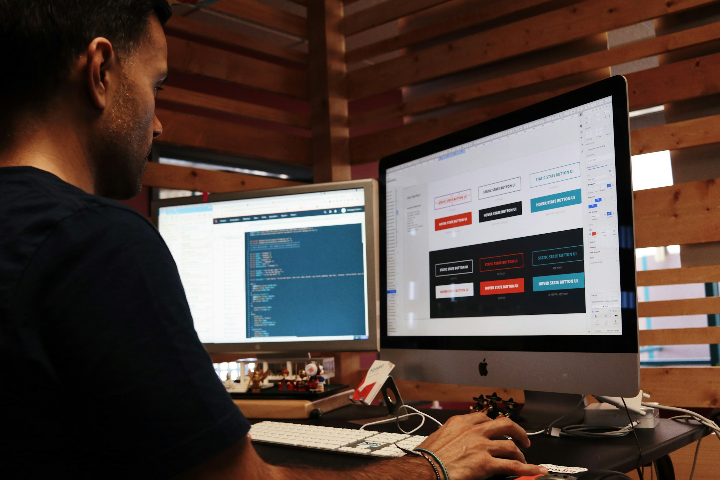
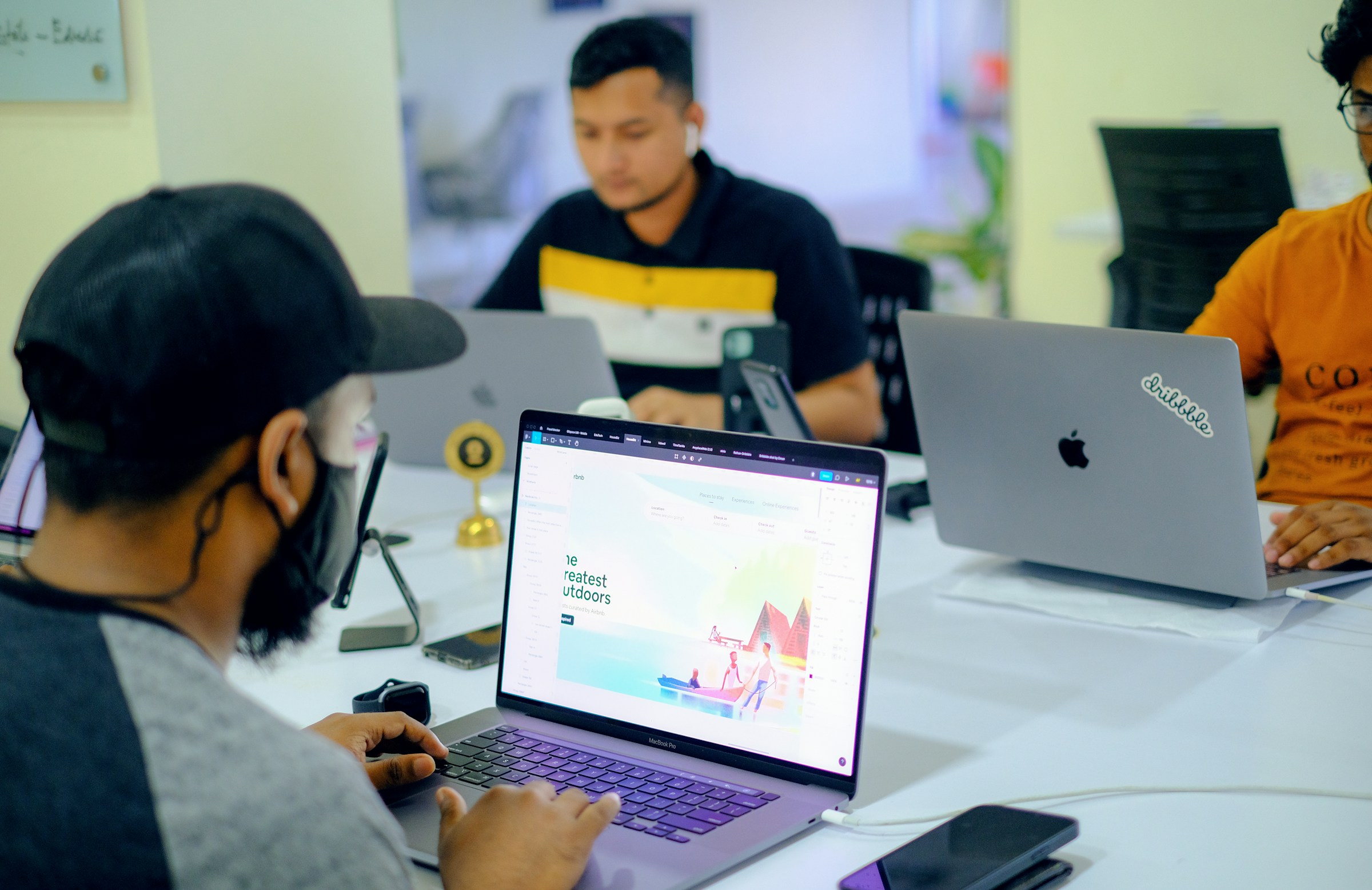
How Do I Optimize My Website For Mobile Webflow?
.jpeg)
Keep Mobile Navigation Functional
According to Statista, mobile devices account for more than half of all online traffic. Your Webflow site must function properly on smartphones and tablets to maximize:
- User experience
- Engagement
- Search engine results
1. Keep Navigation Functional
Thoughtful website navigation is crucial to delivering the best user experience (UX) possible. With limited space on smartphone screens, buttons and menus must be compressed without compromising usability.
Touchscreen operation and thumb positioning make it harder for users to find and tap small elements, so they need to be even clearer than usual. Although all of the steps in the user journey will be the same, mobile design emphasizes how people move from one step to the next.
Here are some ways to do this:
- Design finger-friendly buttons. Make links and buttons large and distinct so users know where they’re going and don’t have to zoom in to navigate.
- Highlight important navigation. Emphasize the menu bar and important CTAs that drive users to the information they seek.
- Add a search bar. Presenting a prominent search bar is especially handy on smartphones when visitors want to find information fast, like a specific ecommerce item.
2. Create Consistent Content
Users should know what to expect when they visit the same site on different devices. They’ll get confused if your mobile version has vastly different content features than your desktop website — another reason why responsive design, which keeps the same elements, might be a better choice than adaptive design, which allows more changes.
Maintain your branding elements and user flow across devices. Keep colors, text, and tone consistent, and use the same navigation options. Mobile versions can take some liberties, like resizing buttons and text for clarity, but they should ultimately be recognizable. Use designs that:
- Maintain logical flow. Present information in the same places on both desktop and mobile so visitors don’t have to guess where to find content.
- Limit pop-ups. Pop-up ads and forms take up more space on mobile than on desktop. Shrink or relocate them so they serve the same purpose without being disruptive.
3. Take Advantage Of Mobile Features
Mobile screens don’t offer the same size and navigation capabilities as desktops. But that doesn’t have to be a bad thing. The small screen lets you pare down your website design and show what matters. You can also use other mobile-specific characteristics, like mobile SEO and location services, to your advantage.
Make sure you:
- Improve SEO: Google uses mobile-first indexing, which means it crawls your website's mobile version and chooses how to rank you based on its content and structure.
- Use location services: Unlike the generally static location of desktop devices, smartphone locations constantly change. Location services help mobile websites serve specific, location-based content or targeted ads.
- Consider download speed: A website designed to consider speed enhances the on-the-go mobile UX. Choose a minimalist design to improve load times.
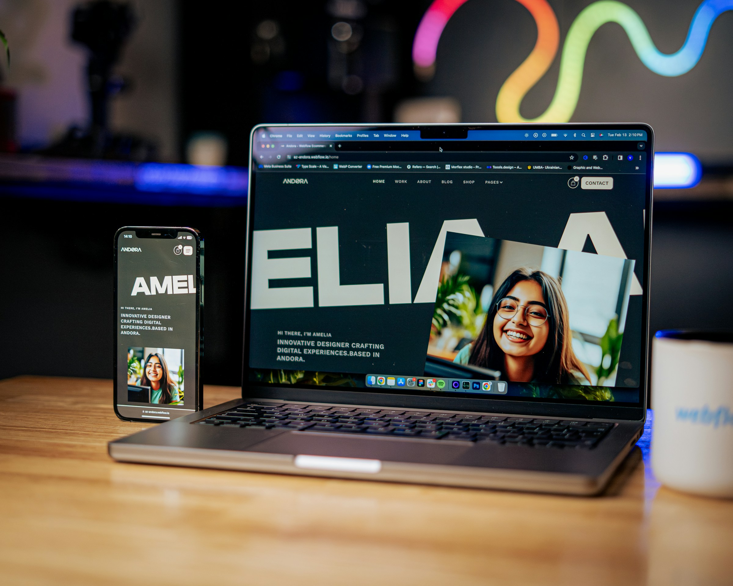
How To Test For Responsiveness In Webflow
.jpeg)
Testing for responsiveness in Webflow is crucial to ensuring your website looks and functions well across all devices. Fortunately, Webflow makes this process pretty straightforward with built-in tools in the Webflow Designer and options to test directly in your browser once your site is live.
While you’re building your site in the Webflow Designer, you can quickly check how your site will look on different devices:
Device Icons
At the top of the Webflow Designer, you’ll notice icons for different devices, like:
- Desktop
- Tablet
- Mobile
Clicking on these icons allows you to switch views and see how your layout adjusts.
Adjusting Elements
Webflow gives you the flexibility to rearrange or resize elements specifically for each device. This means you can make changes in mobile view without affecting the desktop layout, ensuring your site is optimized for smaller screens.
Use Preview Mode
After making adjustments, switch to Preview Mode to interact with your site as if it were live. This helps you catch any issues with navigation, scrolling, or interactive elements on different devices.
Test Responsiveness in Google Chrome
Once your site is live, you can further test its responsiveness directly in your browser. Here’s how to do it using Google Chrome:
Open Developer Tools
Right-click anywhere on your webpage and select Inspect. This will open the Developer Tools panel, where you can see the code and other options.
Toggle Device Toolbar
At the top of the Developer Tools panel, you’ll see an icon resembling a phone and a tablet. Click this icon to toggle the Device Toolbar on. Your webpage will resize to simulate different devices.
Choose a Device
You can select from a list of predefined devices like:
- iPhones
- iPads
- Various Android models
This allows you to see how your website looks on specific devices. You can also manually adjust the screen size to test custom dimensions.
Test Interactions
While in this mode, you can interact with your site just as a user would on a mobile device. Test the navigation, forms, buttons, and other interactive elements to ensure everything works smoothly.
Additional Testing Tips
Test on Real Devices
While browser tools are handy, testing your site on devices is also a good idea. This will give you the most accurate representation of your site's performance in real-world conditions.
Use Online Tools
Several online tools, like BrowserStack and Responsinator, allow you to test your site on different:
- Devices
- Browsers
These tools can simulate various environments, helping you catch any issues you might miss in the:
- Webflow Designer
- Chrome
11 Best Practices For Webflow Responsive Design

1. Prioritize Your Navigation for Webflow Responsive Design
Navigation is one of the most critical aspects of responsive design. Visitors who can’t easily find their way around your site will likely leave. Navigation can get tricky on smaller screens, so it’s essential to simplify and optimize it.
Quick Tip
- Clear Menu Structure: Keep your menu straightforward and concise.
- Hamburger Menu: Use a "hamburger" menu (the three horizontal lines) on mobile devices to save space.
- Prioritize: Make sure your most important links are easy to access, and consider hiding less critical links behind a menu.
2. Create a Mobile-Friendly Design
More than half of the internet’s global traffic comes from mobile phones. With more people browsing on their phones, having a mobile-friendly design isn’t just a nice-to-have—it’s essential. Your site should look great and work well on any screen size.
Quick Tips
- Responsive Layouts: Design layouts that adjust automatically to different screen sizes.
- Optimized Media: Compress images and videos to load quickly on mobile devices.
- Touch-Friendly Elements: Ensure buttons and links are large enough to tap quickly with a finger.
3. Use Call-to-Action Buttons Wisely
Call-to-action (CTA) buttons are crucial for guiding users toward specific actions, like signing up or purchasing. But if they’re not designed with responsiveness in mind, they can be easy to miss or difficult to use on smaller screens.
Quick Tips
- Make Them Stand Out: Use contrasting colors to make your CTAs pop.
- Clear Messaging: The text on your CTA buttons should be action-oriented and direct (e.g., Sign Up Now).
- Avoid Clutter: Avoid overloading your page with too many CTAs—this can confuse your visitors.
4. Be Specific with Your Words
Clear, concise messaging is especially important for responsiveness. On smaller screens, you have less space to communicate your message, so make every word count.
Quick Tips
- Organize with Headings: Use headings and subheadings to break up content.
- Short Paragraphs: Keep your paragraphs short to make your content easier to scan.
- Bullet Points: Use lists to present information clearly and easily.
5. Embrace Negative Space
Negative space, or the empty areas around your content, plays a huge role in making your design look clean and balanced. It also helps guide the viewer’s attention to the most important parts of your site.
Quick Tips
- Don’t Overcrowd: Give your content room to breathe.
- Strategic Use: Use negative space to highlight key content or calls to action.
- Balance: Aim for a good balance between content and white space to keep your design visually appealing.
6. Plan Your Content Organization Before You Design
Imagine trying to build a house without a blueprint—that’s what designing a website without planning your content is like. Knowing how to organize your content is crucial to creating a responsive design.
Quick Tip
- Content First: Plan your content structure before diving into the design process. This helps ensure that your content and design work together harmoniously.
7. Typography Matters Even More on Smaller Screens
Typography isn’t just about picking a nice font—it’s about making sure your text is readable, especially on smaller screens. Good typography enhances readability and makes your site more user-friendly.
Quick Tips
- Legible Fonts: Choose a font that’s easy to read, even at smaller sizes.
- Appropriate Size: Use a font size large enough to read comfortably—16px for body text is a good starting point.
- Spacing: Pay attention to line height and spacing to avoid cramped text or awkward gaps.
8. Create and Test a Responsive Prototype
Before going live, testing how your design works across different devices is essential. A functional prototype can help you identify and fix any issues before your site goes live.
Quick Tip
- Test on Real Devices: Use actual phones and tablets to see how your site performs in the real world, not just in your design software.
9. Stick to the Fast Lane with Responsive Images
Images can significantly impact your site’s loading speed, especially on mobile. Responsive photos ensure your site loads quickly on any device, which is crucial for user experience and SEO.
Quick Tips
- Optimize Images: Scale images appropriately for different screen sizes.
- Speed Matters: Ensure your images load quickly by compressing them without losing quality.
10. Power Your Layouts with Flexbox
Flexbox is a powerful tool in Webflow that helps you create responsive layouts without complicated code. It’s great for building creative layouts that adapt well to different screen sizes.
Quick Tip
- Use Flexbox: Apply Flexbox to parent containers to control how their children's elements behave across various devices.
11. Continuous Improvement and Optimization
Responsive design isn’t a one-and-done task. It’s an ongoing process that requires regular updates and optimizations based on how users interact with your site.
Quick Tip
- Monitor and Update: Use Webflow’s analytics to track user engagement with your site and adjust as needed to improve responsiveness and overall user experience.
Related Reading
- Best Webflow Agency
- Webflow Designers
- Webflow Development Services
- Hire A Webflow Designer
- Webflow Website Development
- Webflow Enterprise Partners
- Hire Webflow Expert
- Webflow App Development
- Webflow Agencies
- Webflow Development Agency
- Top Webflow Agency
- Webflow Web Design Agency
- Webflow Website Examples
- Best Webflow Development Company
- Top Webflow Design Agencies
- Top Webflow Development Agency
- Best Webflow Development Agency
- Hire Webflow Developer
- Webflow Accessibility
- Webflow Designers for Hire
- Webflow Sitemap
- Webflow Forms
- Webflow Content Management
- Webflow Localization
Why Choose Webflow For Web Development?
Visual Design with Precision
Webflow's visual editor gives you control over design elements. You can see changes in real-time as you adjust:
- Layouts
- Fonts
- Colors without needing to write code
This visual approach helps designers achieve their exact vision while maintaining full control over responsive design elements for various screen sizes.
Code-Free Development
One of Webflow’s major advantages is its ability to build websites without needing to code. The drag-and-drop interface and pre-built components enable users to design complex websites quickly. This is particularly useful for designers who want to focus on aesthetics and user experience without opening:
- HTML
- CSS
- JavaScript
Responsive Design
Webflow makes creating responsive websites that look great on any device easy. The platform provides tools to adjust designs for different screen sizes, ensuring your site is optimized for:
- Mobile
- Tablet
- Desktop views
The responsive design features help maintain a consistent user experience across devices.
Powerful CMS and Dynamic Content
Webflow’s built-in CMS allows users to manage dynamic content effortlessly. You can create custom content types (blogs, portfolios, or product listings) and design templates that automatically populate with data.
This flexibility simplifies content management and keeps your website up-to-date with minimal effort.
Advanced Animations and Interactions
Webflow offers robust tools for creating animations and interactions. Users can design complex animations that respond to user actions, such as:
- Scrolling
- Clicking
- Hovering
These interactive elements enhance user engagement and add a polished, professional touch to your site.
Custom Code Integration
For developers who need to add custom functionality, Webflow supports the integration of custom code. You can insert:
- HTML
- CSS
- JavaScript to tailor the site’s behavior and appearance beyond the built-in options
This flexibility allows for advanced customizations and integrations with third-party services.
SEO Tools
Webflow provides built-in SEO tools to help optimize your site for search engines. Features include:
- Meta tag management
- Alt text for images
- Automatic sitemap generation
These tools help improve search engine rankings and visibility without needing external plugins.
Subscribe To A Guild of World Class Webflow Developers with Our Webflow Development Agency Today
NUMI is a webflow development agency that world-class webflow developers and product designers power. Backed by Y Combinator, NUMI handles all of your startup's sourcing/vetting/hiring needs for design. Our fabuolous design team ensures all your design work is done well.
NUMI helps with:
- Product design
- Web design
- Framer development
- Webflow development
- Mobile design
- Prototyping
- UX design
- All of your startup's design needs
Expert Design Team
Subscribe to a guild of world-class designers ready to embed on your team today. Schedule a call with us today to learn more!


